Chasing click-through rates
For the last few years of my tenure at Envato I was part of the video team. Amongst many other great things, we took the Envato Tuts+ YouTube channel from zero to over 1.6M subscribers. My main role was video producer, but one of my other contributions was designing and constantly refining the hundreds of thumbnails.


YouTube offers native split testing on thumbnails for channels with a big enough following, so for every video we published we’d test three thumbnails.
But when traffic sources within the YouTube platform are so varied how do you optimise for all scenarios? For example, if a potential viewer sees your thumbnail on their YouTube home page, it’s likely to be quite large, and they’re probably familiar with your channel already. But if they happen across it in the hallowed “Suggested” sidebar, it will be much smaller—and if it fails to make an immediate impact they’re far more likely to scroll past.
Here are some of our learnings.
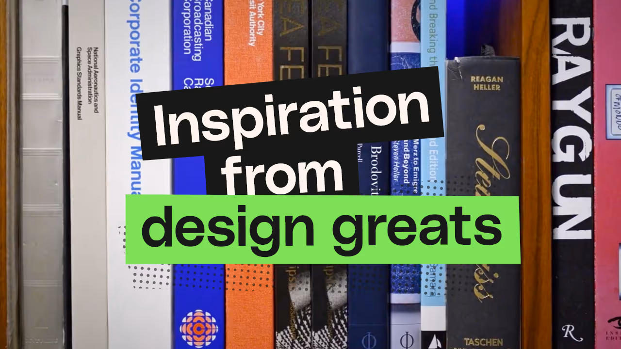
Make it readable
Thumbnails may be designed at 1280x720px but they’re usually displayed much smaller. Given that users’ eyes are skimming past your thumbnails at lightning speed, any text needs to be impactful and immediately readable.
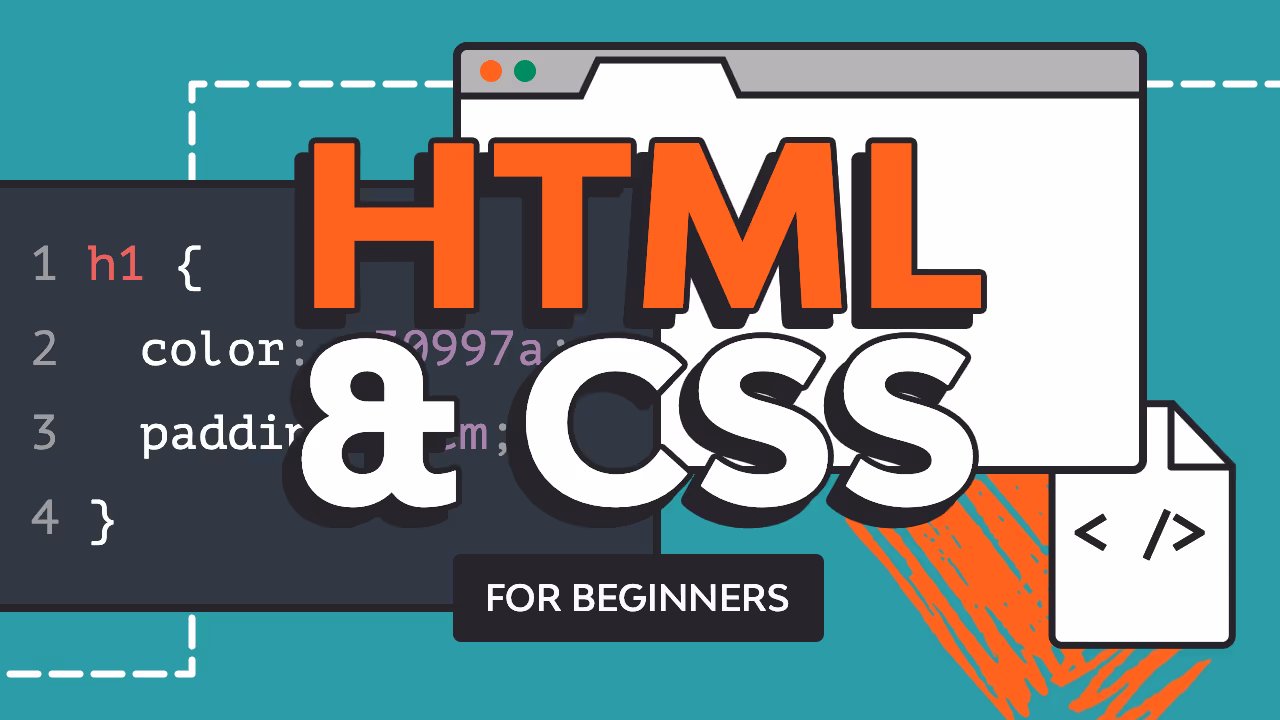
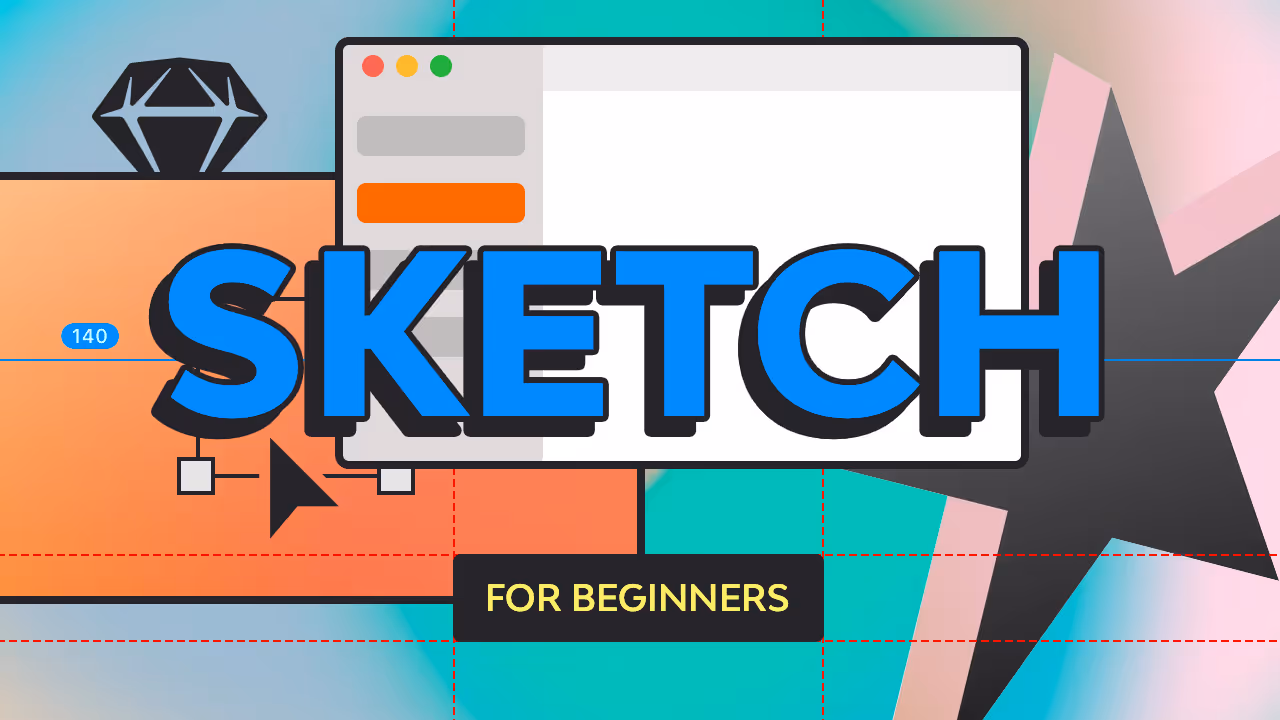


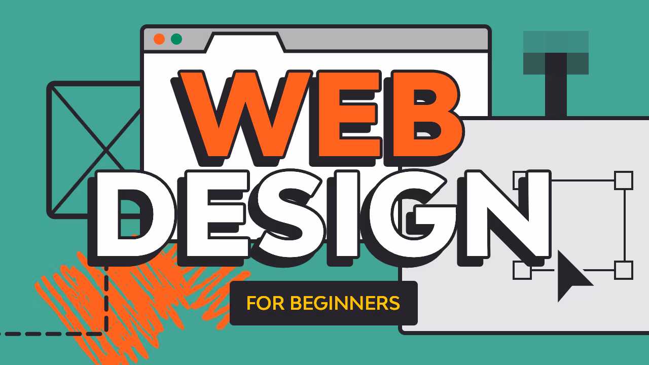
The green Web Design for Beginners thumbnail was one of the channel’s most successful designs. Clear colour contrast, matched with bold, outlined type, gave it high CTR scores across all sources of traffic.
It was meant to be a one-off, purely reflecting web design trends of the time. But it was so effective we continued the design through many of our foundational courses, giving us brand recognition for the series.
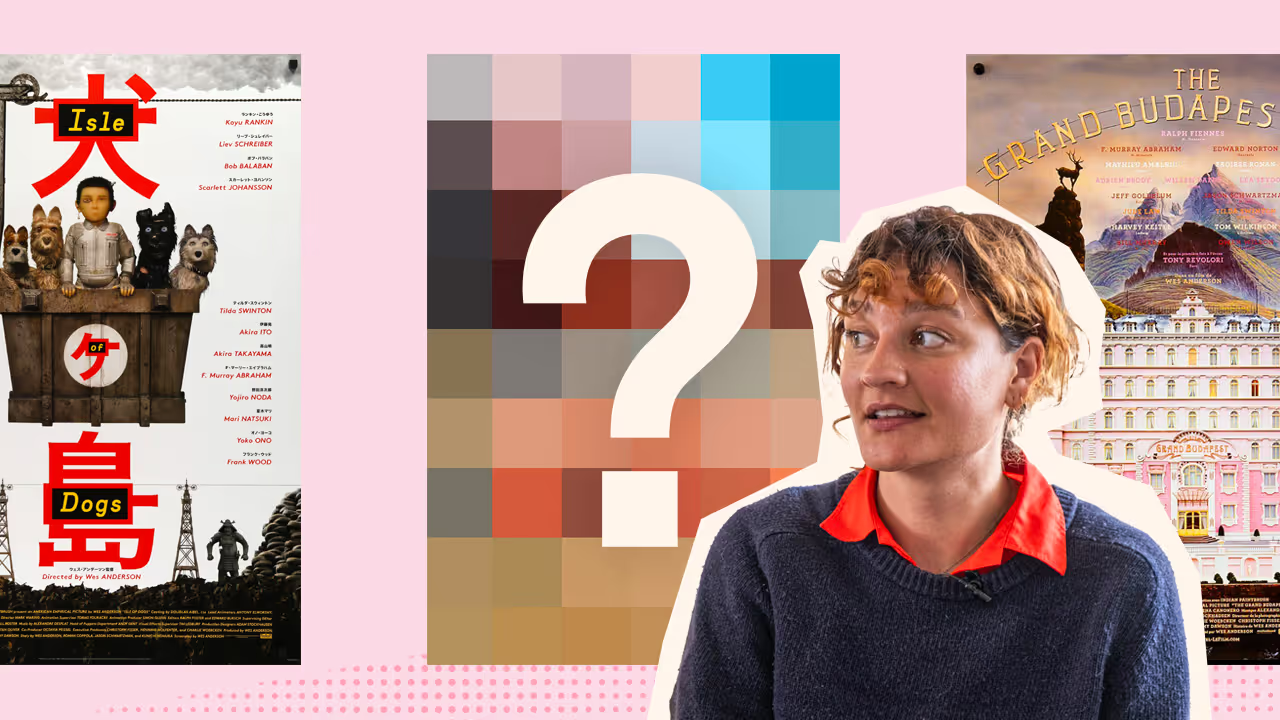
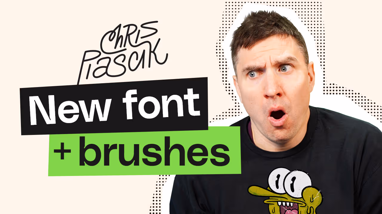
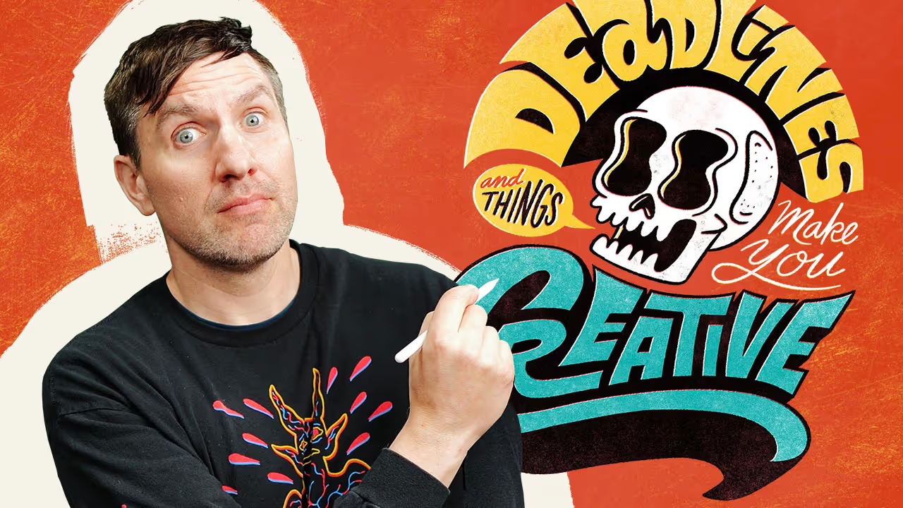
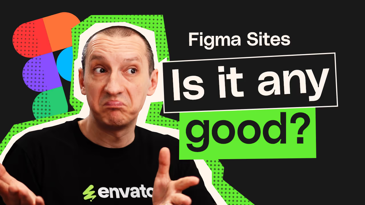
Viewers respond to personality
The presence of a face (plus a healthy dose of exaggerated expression) often connects with viewers and gives a thumbnail the edge. Many of our instructors have their dedicated followers too, so making it clear who the video will feature is helpful.
The last thumb here also shows the end result of Chris Piascik’s tutorial, which is great motivation to click.

Curiosity gap
Highlighting that space between what a viewer knows, and what they want to know, is a perfect tool for getting a click. How do they get from point A to point B? Which was voted the best thing? What went wrong along the way?

Dark and saturated
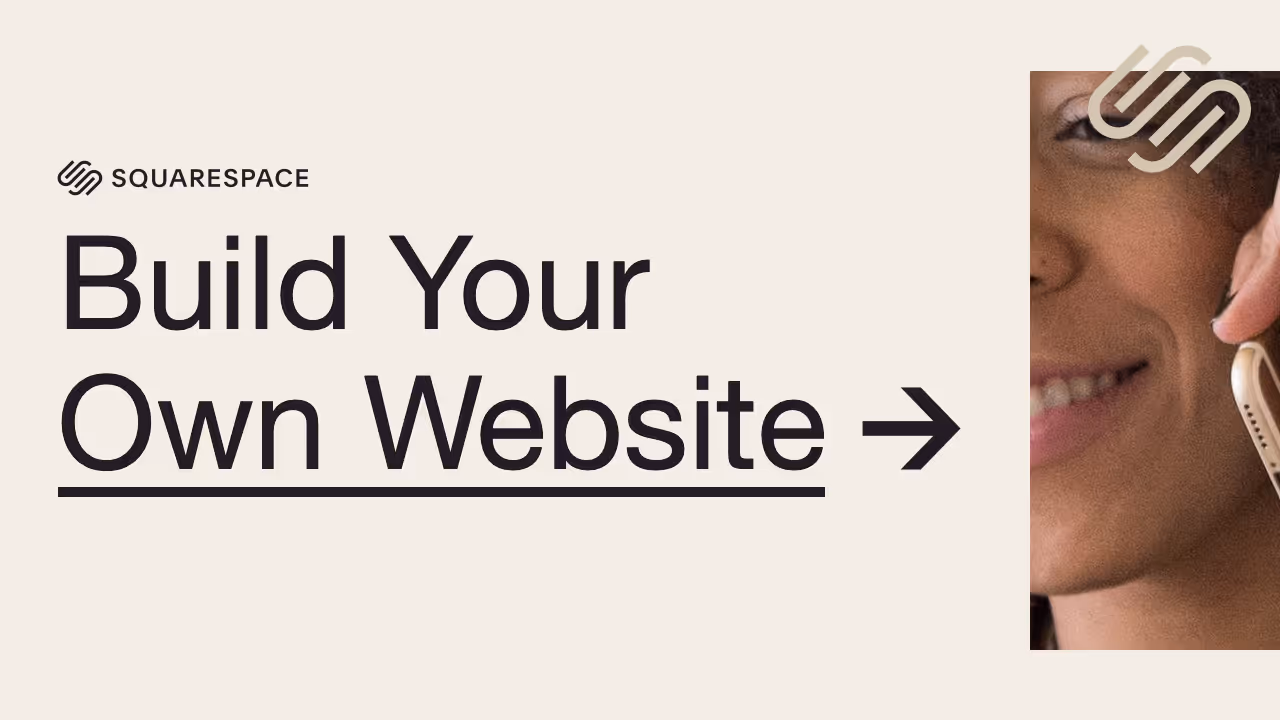
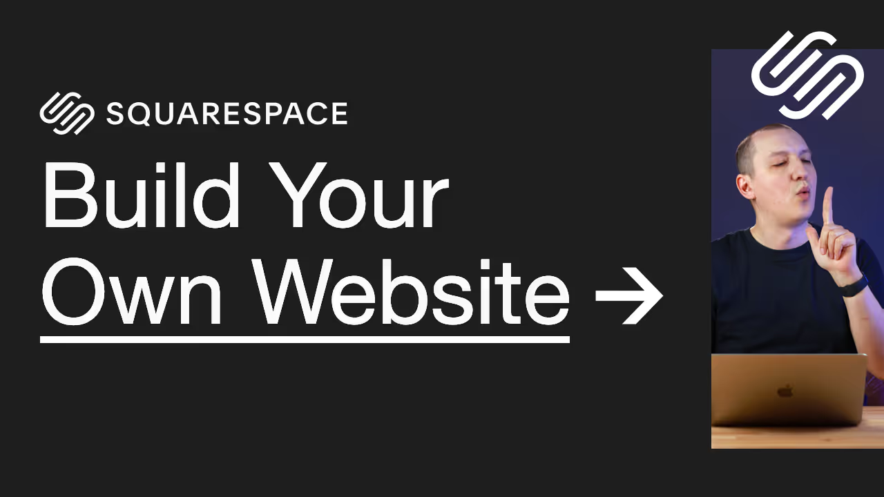
Highly saturated colours and positive hues (warm, as opposed to cool) will usually beat something more muted. A dark background will often beat a lighter variant (and there’s that whole thing about light text on dark perceptually appearing to be heavier than dark text against light). From the Squarespace thumbs below, the darker was the victor by quite a stretch:
And so, for a time, we experimented with a range of thumbnails which leaned into dark and saturated aesthetics.
Branding is complicated
Branding a YouTube channel via its thumbnails can be complex. The reality is that most people won’t view a channel’s dedicated page at all—instead they’ll come across its videos in amongst videos from other channels (on their own homepage, for example). Whilst a visually harmonious channel page is obviously desirable, and the ability for viewers to recognise who’s behind a video, the importance of visually beating the competition takes priority.
When Envato rebranded in 2024, we naturally implemented aspects of the new visual direction on YouTube too, all the while staying as true as possible to our learnings about what makes for effective thumbnails.
Some things we had to turn a blind eye to, of course. Pale backgrounds and the use of green weren’t always optimal for CTRs, but they were a vital part of building brand awareness.

Wow. A whole page about YouTube thumbnail design and I didn’t once mention Mr. Beast.
